Designing Color Combinations by Job Role: Zoning Strategies for Safety Jackets
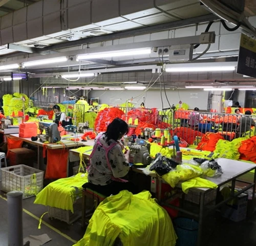
On many worksites, every worker still wears the exact same hi vis jacket: same colour, same design, same markings. It looks tidy in photos-but in real operations, it can cause confusion.
Who is a supervisor? Who is a visitor? Who is allowed in high-risk zones? Who is first-aid trained? If everyone is wearing the same high-visibility yellow, it takes longer to identify the right person, especially in noisy or emergency situations.
That's where a safety jacket color coding system becomes a powerful tool. By using role-based colour combinations and zoning strategies on safety jackets, you can improve visibility, accelerate communication, and turn your hi vis clothing into a practical management system.
This article explains how to design colour combinations by job role, how to apply colour zoning on safety jackets, and how to implement a clear, scalable system across your sites.
Why Color Coding Matters for Modern Safety Jackets
From simple hi vis to role-based visual management
Traditional PPE thinking:
"As long as they wear hi vis yellow or orange, we are safe and compliant."
Modern thinking adds another layer:
"We also need to see roles at a glance – supervisors, visitors, subcontractors, emergency teams – not just 'somebody in hi vis'."
A structured safety jacket color coding system helps you:
Identify roles and responsibilities in seconds
Reduce miscommunication in noisy environments
Support incident control and emergency response
Make toolbox talks, inspections and audits more efficient
Instead of being purely a safety requirement, your high-visibility jackets become part of a visual management system similar to colour-coded helmets or badges.
Key functions of colour in safety workwear
Colour on safety jackets serves several functions at once:
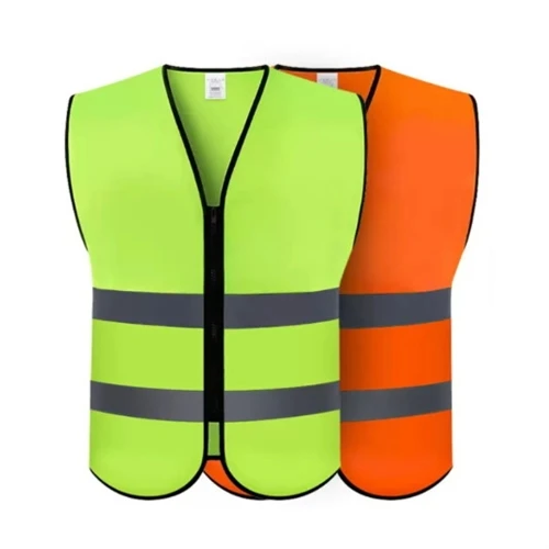
Visibility: fluorescent yellow, orange or red improve daytime visibility.
Role identification: extra colours or panels distinguish workers, supervisors, visitors, first-aid teams, etc.
Risk communication: colours can indicate authorisation level for certain zones or equipment.
Branding: corporate colours, logos and consistent visual identity across projects.
A good safety jacket colour coding system respects regulatory requirements and adds clear signals for role recognition.
Where colour zoning fits in your PPE strategy
Safety jackets are often the most visible garment on site. Colour zoning on jackets should be aligned with:
Hi vis vests and rain suits
Trousers and bib pants
Helmet colour coding
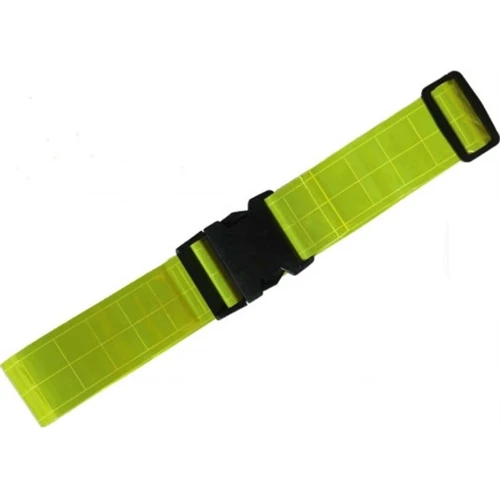
Armbands, belts and accessories
When all these elements share a consistent colour logic, your site becomes easier to manage and easier to audit.
Core Principles of Color Zoning on Safety Jackets
Jacket zones you can design
Before deciding on colours, you need to decide where the colours will appear. Typical jacket zones include:
Upper torso and shoulders – high impact area, very visible in photos and at a distance
Chest and back panels – great positions for logos and role labels
Lower "black-bottom" or dark bottom zone – often navy or black, hides dirt and oil
Sleeves and cuffs – can carry contrast colours or piping
Hood and collar – visible in rain and cold conditions
Colour zoning safety jackets means assigning specific colours to these areas in a consistent way. For example:
Fluorescent yellow base + navy bottom + red shoulder yoke for supervisors
Fluorescent orange base + black bottom for visitors or subcontractors
Balancing hi vis standards and role colours
Whatever colour combinations you design, you must not compromise high-visibility performance. For most markets, that means respecting EN ISO 20471 or ANSI 107 requirements for:
Minimum area of fluorescent background material
Minimum area and placement of reflective tape
Some guidelines:
Keep fluorescent yellow or orange as the primary background colour.
Use navy/black contrast bottoms ("black-bottom safety jackets") to hide dirt without reducing hi vis area too much.
Add role colours (red, blue, green, grey, etc.) in limited zones: shoulders, upper chest panel, collar, piping or armbands.
The goal is that your safety jacket color coding system still looks like serious safety clothing-not like a sports jacket.
Contrast, readability and distance recognition
Colour zoning must also work from a distance:
Ensure strong contrast between base hi vis colour, dark bottom and any role accent colour.
If you print text such as "SUPERVISOR", "VISITOR" or "FIRST AID", choose colours that keep text readable in bright sun and at night.
Avoid overly complex patterns or too many colours, which can confuse workers and weaken the message of your colour coding system.
Designing Color Combinations for Different Job Roles
Frontline workers and machine operators
Frontline workers are the largest group and usually spend the most time inside high-risk zones. Their jackets should focus on maximum visibility and durability.
Typical design:
Base colour: fluorescent yellow or fluorescent orange
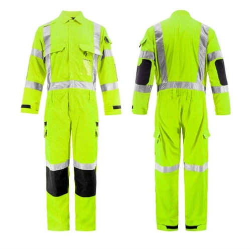
Contrast bottom: navy or black ("black-bottom safety jacket") to hide dirt
Reflective tape: standard stripes on torso, arms and shoulders
This "default worker" design is the foundation of your safety jacket color combinations. Every other role will be defined relative to this baseline.
Supervisors, team leaders and safety officers
Supervisors, foremen and HSE officers need to stand out from frontline workers so they can be located quickly when decisions or approvals are needed.
Design ideas:
Same hi vis base as workers, but add a distinct colour zone:
red or blue shoulder yoke
coloured upper chest panel
coloured vertical stripe or band around the upper torso
Add clear text (print or reflective): "SUPERVISOR", "TEAM LEADER", "SAFETY OFFICER"
This allows your safety jacket color coding system to highlight authority roles without changing the overall high-visibility look.
Visitors, subcontractors and trainees
Visitors and trainees often have different training levels and permissions. They may need to be escorted or restricted from certain areas.
Design ideas:
Use a different fluorescent base colour than your core crew, if allowed by your local standards.
Or keep the same hi vis base colour, but define a special contrast colour for visitors (e.g., light grey or special panel design).
Include text such as "VISITOR" or "TRAINEE" in a fixed position (upper back, chest badge area).
This approach makes it easier to:
Count visitors at a glance during site tours
Recognise who needs extra supervision during tasks
Identify who should not be left alone in high-risk zones
Emergency response and first-aid teams
In emergencies, you want to find first-aid and emergency response personnel in seconds. They need jackets that remain highly visible and distinct from regular crews.
Design ideas:
Hi vis base (yellow or orange) with a green or blue chest/back zone
Large cross or first-aid symbol printed on chest and back
Reflective "FIRST AID" or "EMERGENCY RESPONSE" text
This way, your safety jacket color coding system helps direct injured workers or colleagues straight to trained responders, even in smoke, poor light or crowded conditions.
Zone-Based Management: Matching Colors to Areas and Risk Levels
Site zoning vs. jacket zoning
Many sites already use physical zones:
High-risk machinery zones
Traffic routes
Pedestrian-only areas
Restricted access zones
Your safety jacket colour coding system can mirror this:
Workers authorised in high-risk zones wear jackets with a specific role colour (e.g., red shoulders).
Support staff or visitors stay in low-risk zones with a different colour combination.
Emergency teams have their own distinctive combination.
This creates a consistent visual language: colour on the ground (signs, floor marking) and colour on people (jackets, helmets).
Using colour coding to control access and permissions
Colour zoning can support access control:
Only workers with certain colour-coded safety jackets are allowed to operate equipment or enter fenced areas.
Supervisors and safety officers have colours signalling that they can authorise work or lock-out/tag-out procedures.
Security and gate staff can verify permissions faster by checking jacket colours and text, not only badges.
This is especially helpful on large, multi-contractor sites where many companies and agencies work together.
Integrating jackets with helmets, trousers and accessories
To maximise clarity, combine your safety jacket color coding system with:
Helmet colours (e.g., white for supervisors, yellow for workers, blue for visitors)
Hi vis trousers or bib pants in matching contrast colours
Reflective armbands, belts or vests in role colours
Bags or backpacks with similar colour logic for on-site staff
When jackets, helmets and accessories share the same role-based colour code, everyone on site quickly learns "who is who".
Practical Guidelines for Implementing a Color Zoning System
Step-by-step rollout plan
Map roles and risk levels
List all roles on site: workers, operators, supervisors, HSE, visitors, emergency team, etc.
Group roles into 3–6 visual categories
Too many colour combinations will confuse people. Keep it simple and scalable.
Define base hi vis colours and role colours
Decide which roles use fluorescent yellow, which use fluorescent orange, and which roles only have accent colours.
Assign colours to jacket zones
Example: contrast bottom = dirt protection; shoulders = role colour; chest panel = text area.
Align with standards and brand
Check that your design still respects EN ISO 20471 / ANSI 107.
Match corporate colours where possible without hurting visibility.
Pilot the system on one site
Test comprehension in real conditions, gather feedback, adjust if needed.
Roll out across sites
Once confirmed, roll the system into your procurement specs and supplier agreements.
Common mistakes to avoid
Too many colours and categories – if workers need a chart to decode every jacket, the system will fail in practice.
Colour clashes with hi vis base – using non-fluorescent colours too broadly so the jacket looks less like PPE and more like casual wear.
No documentation or training – workers see new jacket colours but never learn what they mean.
A useful test: if a new worker can understand your safety jacket color coding system from a simple A4 poster in five minutes, you are on the right track.
Documentation, training and signposting
To make the system stick:
Create a colour zoning chart showing each role and its jacket/helmet combination.
Print the chart for induction rooms, offices and break areas.
Include colour coding explanations in site inductions, toolbox talks and contractor briefings.
Update internal PPE guidelines and purchase specifications to lock the system in.
Case Examples: Color Combinations for Typical Industries
Construction and roadwork
Example layout:
Workers: hi vis yellow jacket with navy bottom, standard reflective tape
Supervisors: same base + red shoulder yoke + "SUPERVISOR" text
Visitors: hi vis orange jacket or vest with grey contrast panels and "VISITOR" label
Traffic controllers: hi vis orange jacket with additional reflective patterns
From this section, you can naturally link to product pages like:
hi vis safety work wear jackets
black-bottom safety jackets for construction sites
high visibility police jacket for duty and traffic control
Logistics and warehouse operations
Example layout:
Pickers & drivers: hi vis yellow jackets with black bottom for dirt resistance
Shift leaders: same jacket with blue shoulder panels and printed role text
Night shift: jackets with enhanced reflective tape layouts or extra reflective piping
Internal links could point to:
reflective workwear hoodies
hi vis rain suits for outdoor loading areas
Utilities, energy and public services
Example layout:
Field crews: hi vis yellow or orange jackets with navy bottom
Supervisors: same hi vis base + coloured chest panel (e.g., dark green) + role text
Emergency / first response teams: hi vis jackets with green or blue role panels and "FIRST AID" or "EMERGENCY" wording
Here you can link to:
CAT 2 FR coveralls for electricians
FR hi vis jackets and coveralls for utilities
How We Support Custom Color Zoning for Safety Jackets
OEM colour combinations and panel designs
As an OEM manufacturer, you can:
configure base fluorescent colours (yellow, orange, red)
design contrast bottoms (navy, black)
add role-colour panels on shoulders, chest or back
adjust reflective tape layouts to maintain compliance
Buyers can send role descriptions and desired colour logic; you provide sketches and sample jackets for approval.
Matching jackets, trousers and accessories by role
To make the colour coding system complete, offer:
role-based jacket + trousers + vest sets
matching reflective belts, armbands or bags in role colours
custom packaging and labelling clearly indicating each role category
This turns the safety jacket color coding system into a full uniform program, not just a single product.
From idea to production: working with B2B buyers
Your typical workflow could be:
Discuss job roles, sites and existing PPE strategy with the buyer.
Propose 3–5 colour-coded safety jacket concepts with zone diagrams.
Develop and send samples for each role category.
Adjust design based on feedback and standard compliance checks.
Begin bulk production and help the customer roll out training and documentation.
This consultative approach makes you not only a hi vis jacket supplier, but a partner in visual safety management.
Turn Color Zoning into a Management Tool
Colour on safety jackets used to mean only "bright and reflective". Today, it can also mean clear roles, better coordination and faster reactions.
A well-designed safety jacket color coding system:
keeps jackets compliant and highly visible
distinguishes workers, supervisors, visitors and emergency teams
supports access control and risk management
strengthens your corporate image and PPE program
If your crews all look the same in hi vis yellow, now may be the right time to review your colour strategy and move towards a role-based colour zoning system for safety jackets and hi vis workwear.